Description
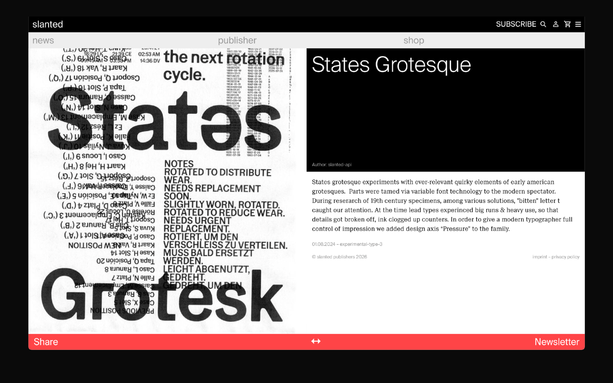
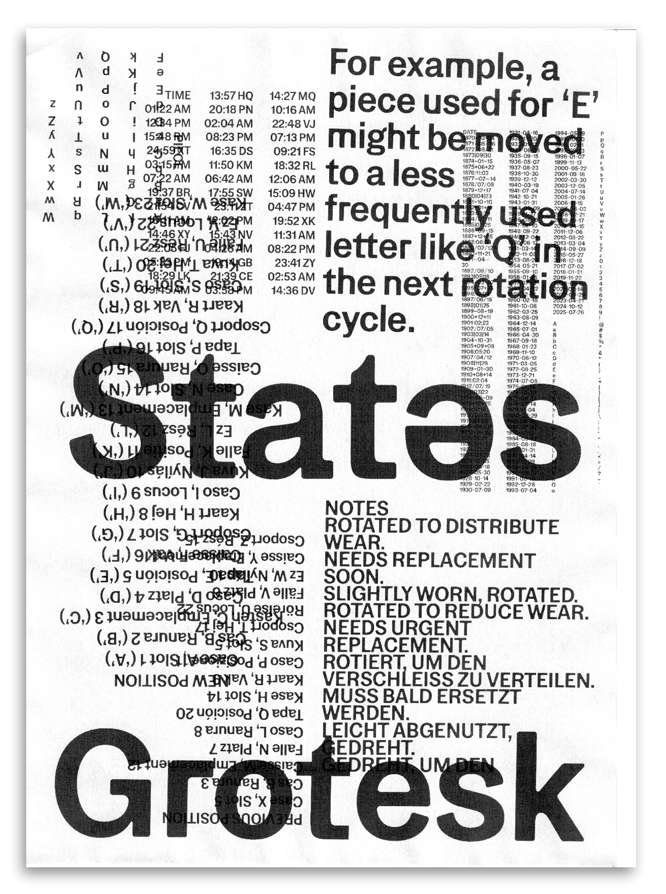
Digital poster featuring States Grotesk for Slanted Magazine. The typeface is a quintessential grotesque with a few surprises under its hood, released in two versions: States Grotesque and States Rounded. A selection of alternates turns the imperfection of physical printing into standout features, while celebrating grotesque eccentricities that undeservedly ended up in the dustbin of history. For the design, a somewhat rustic printing method was chosen - a low dpi black and white Hewlett Packard homeoffice printer that rhymes well with States Grotesk's design features. Layers of common issues found in metal casting coupled with notes from diaries of typesetters of the time that inspires the typeface were overprinted, composing the content of the poster. The released typeface is called "...Grotesque" instead of "...Grotesk", a working title shift which, if intentional, would be undoubtedly a conceptual bullseye.